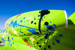
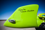
 Chairman Emeritus Robert Duncan and his wife, Karen, surround themselves with the things they’re passionate about: aviation and art. So, when Duncan Aviation acquired a new Citation M2, they wanted the jet’s paint scheme to reflect the brush strokes of an artist, an abstract artist. They also simultaneously took the term “green plane” to another level with this lime green wonder.
“This is a flying billboard for Duncan Aviation’s paint department,” says Robert Duncan at the jet’s unveiling last week.
 The paint scheme’s designer, Teri Nekuda, has 24 years of experience combining colors and materials to match a variety of customers’ needs and desires, and she used the same approach she does with all her customers when Robert and Karen asked to explore paint schemes at Duncan Aviation’s Lincoln, Nebraska, facility’s design center.
“It’s enjoyable to create a paint scheme that people don’t readily expect to see on an aircraft. The wow factor gets people to react, contemplate and dream of what possibilities lay on the horizon,” says Nekuda.
After more than 50 renderings, Nekuda and the Duncans had the paint scheme narrowed down to two options: a lime green or bright blue base with paint splatters dotting the fuselage. When asked to describe the final product in one word, Teri responds with “fun.”
“It’s fun on so many levels. I look at it and I start to recognize shapes and images. There’s a pair of Mickey Mouse ears over here and Woodstock there. It spurs this childlike sense of excitement and creativity. That’s a cool feeling to have at any age,” she says.
Of course, there were several other ideas on the table before the final was approved. Robert initially wanted to explore the idea of a decal on the aircraft, allowing it to be easily changed after just a few years.
“It a great idea and I think we’ll end up using decals eventually, but this one looked a bit thick after the clear coat was applied. Also, the decal isn’t simply printed on a clear background, so any space outside the paint splotches would have to be lime green and match the paint perfectly, or have a black outline. In the end, this was too complicated of a paint scheme to try and implement decals for the first time.”
The Duncans also toyed with the idea of having graffiti on the M2, but the design team was concerned that even though the graffiti might be well-received and have a positive message in the United States, not all countries will view the symbol the same way. So when Paint Shop Manager Doug Bohac mentioned he had recently seen a motorcycle covered in paint splotches, the idea stuck.
“Robert makes me explore other ideas I might not normally gravitate toward because he gives me some direction, but not enough that he stifles my creativity with suggestions,” says Nekuda.
Even after all these changes and updates and scrapped ideas, Nekuda says it’s so rewarding to see how excited a customer gets when the project just—clicks.
“That’s when I know I’ve succeeded at something—when they can’t wipe that smile off their faces,” she says. “That’s a good feeling. That makes every minute worth it.”
Nekuda has also helped determine the paint scheme on several other Duncan Aviation aircraft.
“Robert and Karen Duncan want something unique. A lot of people like a simple aircraft, but I don’t see Robert as ever having a white airplane. We do things a little differently here,” she says.
Though the paint shop sees a lot of white jets, they didn’t bat an eye when they first received renderings of this complicated scheme. They treated the project just like it was any other customer, providing Duncan Aviation-level quality, delivered the aircraft early and celebrated another job well done.


